Rack ‘Em Up, Part 5: Application Usability
iPads may be on the downward trend, but iPad-controlled mixers are coming out in droves. We round up everything currently out on the market for one giant rack mixer review.
Once you’ve got your session set up, there’s still the matter of mixing. How you get around these apps is just as important as their overall speed.

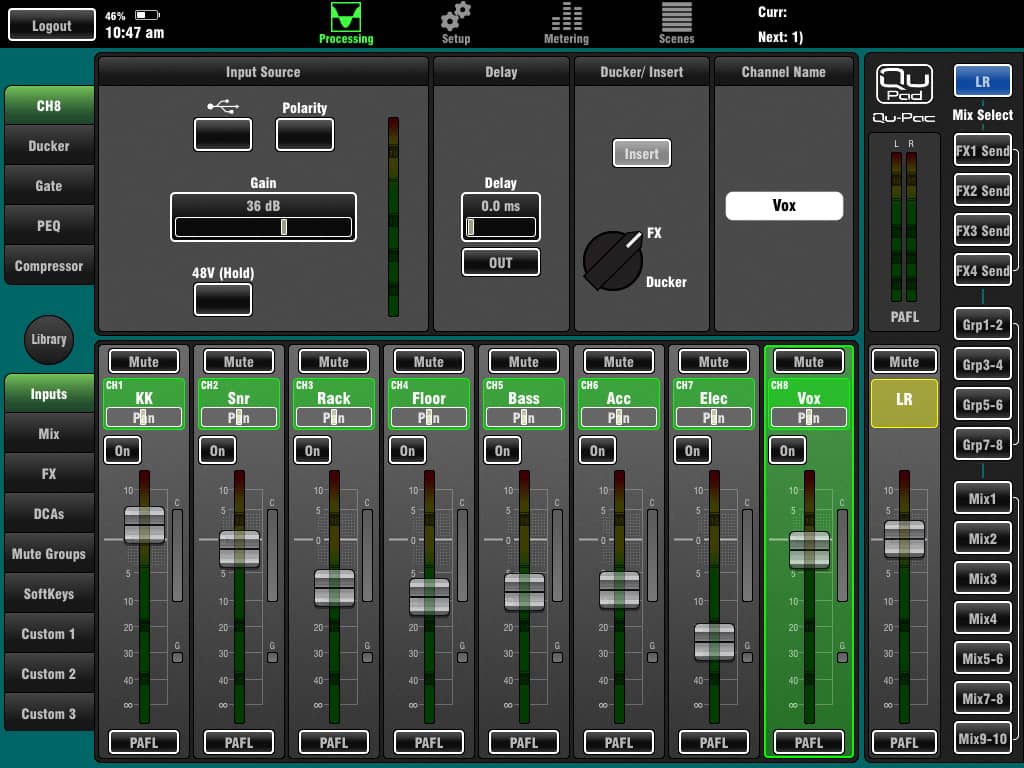
I’m a fan of Allen & Heath’s no-nonsense interfaces. While not the prettiest, every piece of its interface holds to that dictum of form following function. There’s no button too small for fat fingertips, smart colours abound, and there’s plenty of contrast. It’s also the only app to offer two-handed operation, with function buttons on both sides of the central mix window. You can grip it like the steering wheel of a virtual F1 simulator, flicking at the controls with your thumbs rather than digits. An iPad Mini would be the perfect size for Qu-Pad.
On the left side are channel processing selections at the top, separated by a library button, used globally to recall and save presets. Below that are all the input and output fader banks, including the three custom fader banks. On the right are all you mix outputs; Master at the top, FX sends, Groups, and seven custom mixes, four mono and three stereo.
There are a few live-savvy touches throughout; for instance, you can set up delay on inputs (up to 85ms) and outputs (up to 170ms), and you have to hold down the button to turn phantom power on and off.

Behringer’s X Air app was probably my least favourite to navigate. Touch length had to be precisely timed. Too short and it wouldn’t recognise it, and too long, the app thinks you’re butt-dialling. The iPad app is more attractive than its computer-based X Air Edit counterpart, but its teal-coloured GUI still looks like its cut from an ’80s Sci-Fi starship command centre.
The app is divided into two halves. The bottom houses the faders and parameter controls at the top. At first, the space above each channel houses a pseudo-channel strip. From there you can touch different parts and jump straight to particular tabs in the processing strip. There’s eight tabs in all, which requires a bit of swiping to go from the mic gain on the Input page to the Output page’s pan control, which was all on its lonesome at the opposite end of the strip.
The current app version has a few oddities. A small one is that channel naming is done from the setup page, not accessed by tapping on the channel itself. Perhaps most odd is the EQ doesn’t marry between the computer and iPad apps. Both have four-band parametric EQs, but the PC version has a separate high-pass filter, while it’s an option on the lowest of the four bands on the iPad.
There are 11 different mixes you can flick between; one main, six buses and the four effects sends. Curiously, they all have the same channel layout, which includes not only XLR and aux inputs, but also FX returns. It means you can really get yourself into trouble if you accidentally turn up one of the effects sends on the effects return page. It creates a feedback loop on reverbs and delays which, outside of a few genres, is wholly undesirable.
The meters are snappy, there are mutes on every input and output, and the global Advanced button is a nice touch; toggling between simple one-knob-style parameter settings and the full enchilada.

Getting around Mackie’s Master Fader is a breeze. While not the most fully-featured app, the grouping of controls feels the most logical. And it’s the right mix of colour and contrast to really connect you with what’s on display.
The processing sections in the Master Fader channel strip are accessed via touch but thankfully it doesn’t eat up the top half of your screen, the faders remain medium throw, and there are only four tabs to page through, instead of eight.
The drop down side panel lets you mute reverbs and delays, clear solo, tap tempo, and adjust monitor alignment delay and level, as well as talkback level and button.
The right hand side of the app contains all your master and group functions. When you hit an area it balloons to show you all the options available, for instance, Mute Group selection and assignments, which Mix you want to view, and View Groups. While you can group specific faders into View Groups, the only thing I still feel is missing is the ability to reorder faders in custom views like you can on Qu-Pad. With 32 channels, axes, effects, etc, it would be nice to be able to place faders exactly where you need them.

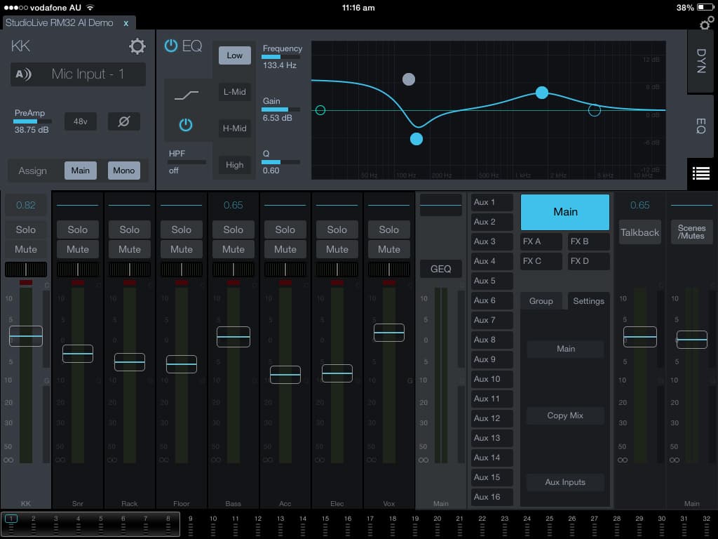
While Presonus’ UC Surface app looks modern, I found the lack of contrast and colours unhelpful for knowing where I was at any point — most everything was a mixture of grey and blue. Navigating around was made super efficient by the meterbridge along the bottom of the screen.
The UI detail is quite miniaturised to fit everything into the app. There’s a lot going on; 32 inputs and 16 mix outputs on top of bussing like FX sends. Sometimes the miniaturisation was inhibiting, the names on the channel faders are quite small, almost illegible for some users I’d imagine. On the other hand, the bottom-of-screen meterbridge, and mini output meters in the Main and FX Send toggle buttons keep everything in view.

There are many ways to navigate the different states of Soundcraft’s Ui app, you can either use the global buttons at the top of the window or learn a diet of single taps, double taps, and holds to jump around. The latter way becomes really intuitive with a bit of exploration and trial and error. It only takes a short time to figure out how to get around, though a read of the manual doesn’t hurt. Everything’s touchable, and there’s typically multiple ways of accessing the same thing; not one prescribed action.
The main meter page allows you to tap any channel and jump straight there. It also shows mute, solo, phantom, phase and Hi-Z, let’s you tap tempo, and individually turn mute groups on or off.
You can save snapshots directly from the master fader channel, or hit the faux LED display to jump to the Shows/Snapshots panel, and a slide-out panel accessed from the Ui logo allows you to toggle between different master fader combos, Mute all, Mute FX, tap tempo, switch to More Me, and importantly, toggle your View and Mix groups on or off.
While there are View Groups, at the moment you can’t drag ’n’ drop channel faders into different orders, but it’s not such a big deal with a smaller I/O count. Four subgroups allow you to process channels together, say, for a drum group you want to parallel compress.
And a handy meter innovation sees the input gain always displayed in blue behind your channel output meter, letting you know if you’re pushing your gains too hard.


RESPONSES