Rack ‘Em Up, Part 4: Setting Up
iPads may be on the downward trend, but iPad-controlled mixers are coming out in droves. We round up everything currently out on the market for one giant rack mixer review.
Across most of the apps, the comfortable operating width displayed about eight channel faders and a master fader. When you add FX, auxes, matrices, subgroups, VCAs, and so on, for 32-channel devices like the Mackie DL32R and Presonus RM32 AI, that small window only shows a tiny part of the picture. So customising what you see before you get to the gig will minimise the stress of finding that crucial fader in time.
Starting with the unit with the smallest complement of I/O — Soundcraft’s Ui. There’s a lot of detail in the Ui’s GUI. The meters are particularly impressive, extending with the faders to almost the full height of the screen. Long-throw indeed. The pixel-perfect detailing extends to the amount of fader glow and turning meter quantisation on or off — the difference between seeing everyone of the 33 LED segments light up, or every pixel. These adjustments aren’t solely for the obsessive aesthete. Turning them off or down gives a slight gain in responsiveness if you’re on a low-powered device. There are also some more drastic GUI salvage points like frame rate juggling and disabling meters altogether. But my iPad 2 still flew through its paces with everything at max resolution.
Even though there are only 10 analogue inputs on the device, Soundcraft has popped in six View Groups, allowing you to assign any channel, aux, effect, etc, to that group. You can’t mix ’n’ match the order they appear, but that’s less of a concern with the limited channel count.
All of these mixers can have multiple control devices hooked up at once, letting you hand over control to band member’s tablets and phones. But keeping their sticky fingers off mix-endangering controls is important. The Ui can limit access to channel levels in either/or both auxes, as well as a sliding scale of other features like master volume, master processing, the media player, shows and global settings.
It doesn’t hide any pages from view, it just comes up with a ‘Locked’ dialogue any time you try to adjust them. It would perhaps be nicer to only have the unlocked channels visible to save beginners the hassle of trying to figure out where their channel is.
Of course, there is the ‘More Me’ scale for that. To access ‘More Me’, you long-press a channel name to ‘Assign Me’, then do the same on the aux output you’re monitoring. Flip the device on its end, and now you’ve got a one-finger balance between you and the rest of the band.

While Behringer has skipped the View Group paradigm on its X Air app, it has an integrated Channel Layout area where you can drag faders around and change their order. It’s a handy inclusion, and the only other app that features a similar (yet more comprehensive) fader arrangement system is Allen & Heath’s Qu-Pad.
A simple grid routing system allows you to assign any input to any channel, but doesn’t show those assignments anywhere on the channel fader view. There’s no indication that Fader 1 has been switched to Input 3, for instance. One nice feature is the ability to switch between Thin and Wide fader views. The thin version is still wide enough to operate and gets all your XLR inputs onto the one page.
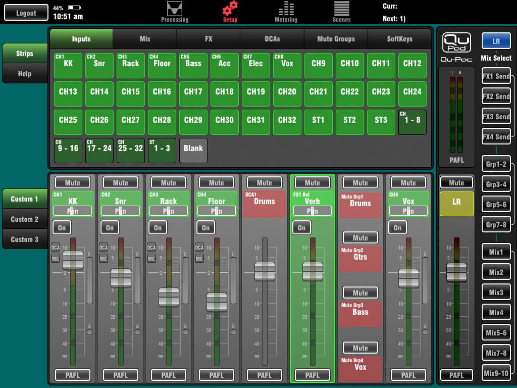
Allen & Heath’s app suffers a bit from the hardware’s touchscreen prowess. While all the other mixers have had to fully embrace an external program as the only way to control all its parameters, the Allen & Heath app was developed as a handy add-on to its Qu series mixers — the ones with faders and a touchscreen. While it makes for a streamlined app, there are plenty of functions you can only access from the hardware device’s screen. Even the Setup page, where you’d expect to find things like routing, is only used to set up your custom fader banks. Overall I found the app incredibly easy to use. But that’s the catch 22. Crouching in front of what is essentially a stage rack to adjust routing and global assignments on Qu-Pac’s five-inch touchscreen, wasn’t the most comfortable. Kicking back with a matrix view on the iPad would have been far nicer.

But back to the highlight of Qu-Pad’s setup routine, those custom fader banks. You can set up all three banks with any combination of inputs, mix outputs, FX sends and returns, DCAs, mute groups and soft keys. For the button-style parameters of mute groups and soft keys, you can choose to insert either one button or groups of four or five into one channel fader slot, maximising space. It’s a simple drag ’n’ drop system that lets you slide up to 32 strips of faders and buttons around to the exact order you desire. Really handy and super flexible, you can even add blank strips to get separation between channels.
There’s not a lot to do on the Presonus; no channel reordering or View Groups to mess around with. There’s a simple DCA group set up, which collects groups of input channels like a View Group, though doesn’t include any other channel types. Those same groups, or the group masters, can be used across your Main mix, all 16 auxes, and effects sends.
While you can lock out users screens based on the output — by aux or FOH mix — there’s no way of locking any specific functions, like master level control or EQ and dynamics, out of the picture. You can set the phones up to respond to cue (follow solo or a particular mix) or main outputs. And Solo can function in either Latch, Radio, or CR mode.
The Mackie DL32R firmware update was the easiest of the lot. The app downloads and stores the latest firmware in advance, then pushes it to the device if it detects a mismatch. Once you give it the go ahead, the device instantly starts to update without having to look for an internet connection or USB device. There were a handful of different firmware styles, the Presonus required you to be logged into your Presonus account before updating, and most others required a flash drive to be inserted, or a direct internet connection with the device.

The Mackie input section gives the most information of any app in one screen. It shows not only the gain, trim, phantom, phase, and A and B sources (which can be routed to any Mic, USB or Dante input, and switched either individually or globally from the recording page). It also lets the user toggle the Subgroups, VCAs, Mute Groups and View Groups that channel belongs to, as well as adjust send levels and mutes for every aux and effect. It’s a lot of info in one page and great for getting a handle on where you’re signal is going.
The routing is also a doddle, with matrix-style assignments for Input A, Input B, Output, USB, Dante and Talkback. Likewise, access limits are controllable down to the nth degree.


RESPONSES