Review: Presonus Studio One v2
Studio One instantly won friends for being lean and mean. Can version 2 meet user demand and stay bloat-free?
Bear with me during a long-winded and waffling, yet relevant and (no doubt) riveting introduction here. It’s not easy endeavouring to take on the big players by releasing a new flavour of DAW and we need some historical perspective here. As we reported last year following the original release of its new Studio One software, Presonus made a significant impact on the market and quickly attracted a faithful user base. Studio One was touted as being ‘bloat free’, meaning Presonus had been very particular about the features included in Studio One and it tried to avoid the more esoteric functions the competitors’ software offered which, frankly, only confused the hell out of most of us anyway.
A simple plan’s always a good one – or, in this case, a simple application is always a good one. However, this policy must have caused a few headaches for Presonus when it decided to release Studio One Version 2… and yes, the marketing department must have chewed a lot of fingernails just agonising over what to call it. In the process of creating a better, more comprehensive DAW has Presonus been forced to chuck the ‘bloat-free’ policy in the bin? Making things even more difficult, Presonus enjoys a good relationship with its users via a relaxed, flame-free forum with Presonus administrators always active. As you can imagine the obligatory “What do you want to see in the next version of Studio One?” thread is chockers with opinions from users who are convinced that their requirements are the best, most brilliant ideas ever-ever and it’s a no-brainer that Presonus should completely rewrite the entire program to indulge them – functions they use every day, and it’s incomprehensible that others actually don’t. Odd folk, in other words.
So does Presonus honour that good relationship and listen to the roar of a zillion feature requests or not? Does it mean the bloat-free DAW has gotten a little tubby around the waistline with Version 2?
STABLE INFLUENCE
As you’d expect, Studio One offers an impressive audio workspace with good plug-ins and comprehensive editing functions. Previously it lacked stuff like pitch correction and beat detection (can you see where this review is going already?) and the basic Artist version didn’t support third-party plugs, while the Pro version did. MIDI functions were on a par with… hmm, let’s say, ProTools, meaning any aspiring MIDI programmer would be happy unless they need the MIDI editing extremes provided by the likes of Cubase, Logic or Sonar. The included VST instruments are pretty cool and certainly usable. The pianos are nice pianos, the organs are vintage and the synths are trippy – but let’s be honest, they ain’t Absynth or BFD. One thing that got a huge thumbs-up was S1’s stability. With S1 in full flight, but minimised, you could still run emails, monitor Facebook and download complete series of Family Guy and Studio One would cheerfully chug away unfazed in the background. It was awesome. For DAW users who were tired of their software crashing whenever things got only a bit hectic, Studio One was a breath of rock-solid fresh air.
Now you’ve got three versions, Studio One Artist, Producer and Professional. Everything new comes in Professional, so for the moment just assume that’s what we’re talking about and I’ll explain the differences in full later.
STANDING ON CELEMONY
You should have guessed by now that S1 V2 does come with pitch correction and beat detection. Presonus has chosen to join forces with Celemony and its Melodyne software, but instead of just tossing in a freebie plug-in with any purchase of S1 V2, Melodyne Essential has been completely integrated with Studio One. Melodyne is initialised through a right-click menu function to ‘Edit with Melodyne’ and other processes such as rendering any pitch-corrected audio are also done inside S1 dialogues. Presonus is claiming this close integration is a first (although others will undoubtedly follow). You might think that it doesn’t make a great deal of difference except that processes like Undo and Bypass, for example, are part of the S1 menu hierarchy. Then again, pitch correction plugs can be a little daunting the way they take over audio events and with the S1/Melodyne setup it certainly feels like you’ve got more control over what’s happening. Events can be smoothly moved, copied and pasted, or edited in a variety of ways and any pitch-correction processing happily goes along for the ride. I’d suggest too that Melodyne was a good choice by Presonus. Melodyne’s simple (there’s that word again) approach to manipulating audio with those unique ‘blobs’ of sound take a lot of the rocket science out of pitch correction.
NEED TO KNOW


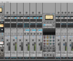
A look at the v2 Mix Window – with its more engaging GUI. Ampire XT (top right) packs 13 different amp models and a choice of 10 cabinets, while Open Air (bottom right) provides convolution reverb – the separate IR Maker plug-in allows you to load your own impulse responses and create custom spaces..


TRANSIENT DETECTION
The Transient Detection feature in S1 is quite understated in Presonus’s ‘what’s new’ blurb. It is, in fact, a whole rack of editing functions under the Audio Bend menu that allows pushing, pulling and generally bullying errant audio performances into some kind of proper timing–otherwise called warping, stretching… whatever, take your pick. The audio is moved between markers with that concertina-like action to create seamless shifts onto the correct beat. Studio One calls it Bending and does it well. Transients can be automatically detected, the detection level can be adjusted or you can add and delete your own markers. This in turn allows you to apply quantisation and even groove effects to your audio. A neat trick is that any audio stretched between two markers turns alarmingly more red in colour as you increase the distance – an indication of your growing desperation, perhaps? – while compressing events are shown as comforting, soothing green.
Studio One Version 2 has introduced comping with layers for each track. Again, it isn’t anything radically new, although Presonus’ system is easier than most: you can select a range of any ‘take’ and double-click to add it to the primary track. Crossfades are dealt with automatically as is a colour-coding feature that helps you instantly refer back to which layer that particular section was sourced from. For the record, creating layers and comping was probably the loudest, most insistent feature request on the forums and it’s great to see Presonus respond accordingly.
TWEAKS & FIXES
Likewise a lot of minor tweaks, too numerous to list here, have been applied across the board to various Tool behaviours, plug-in windows and such. Plainly, Presonus has listened to the feedback and picked the wheat from the chaff – or obviously made development decisions for itself. Most users should be pleased with what’s been improved and what hasn’t been changed. One niggle for me is how the mixer section, which normally sits at the bottom of the window, can be detached and stretched to full screen, yet the size of the actual faders, which I’ve always found a bit short, doesn’t increase (even though the input fader does). If you don’t have many plug-ins or sends running, the result can be a lot of empty, grey panels in the mixer that offer nothing. There is a new Narrow mode where the panels are replaced by long meters, which is interesting to watch, but I still don’t get my longer faders.
GUI POLISH
There’s one enhancement that has divided the larger forum community, creating a thread rampant with emoticons like a bad, smiley rash.
The GUI has been given a wash and polish. Fonts have been sharpened, bold sub-headings have been added, function buttons have either disappeared or appeared, mouse highlighting has become… erm, higher. Studio One doesn’t have any scheme or ‘skin’ options, so users who upgrade to Version 2 can’t avoid these changes. Some people aren’t happy. Myself, I’m well pleased with the improvements. One of my strongest criticisms of S1 was that the whole look of the software, particularly the mixer, was verging on the bland and while I agree that a DAW isn’t supposed to resemble Level 3 of a Sonic The Hedgehog platformer, I’d argue that a lively workplace is inspiring. After all, a real control room with a glittering, flashing SSL console is exciting, right? Not that Presonus has added any pointless eye-candy, but rather it’s managed to make the GUI more engaging… it’s difficult to pin-point, but S1 has definitely lost its blue-grey Vaseline-d appearance and now looks professional and more inviting to work in.
AMP’ED
A few of the new effects in v2 deserve a mention. Studio One’s own guitar amplifier emulator, called Ampire, was rather underwhelming in version one. Hey, it worked, and the limited sounds were okay, but it was never my first choice for converting my fumbling fretwork into Jimi Hendrix-like genius (I need all the help I can get). Now it’s Ampire XT with 13 different amp models and a choice of 10 cabinets, all of which can be assigned to either the A or B channel, then you’ve got eight stomp FX essential to shaping a guitar ‘sound’. That’s the kind of help I need! Also new in the effects rack, the Open Air convolution reverb should satisfy the reverb aficionados and if it doesn’t, there is the IR Maker plug-in which allows users to load their own impulse responses and create custom spaces.
PROJECT POLISH
Back to the different versions of S1 V2: Artist is the basic software that still won’t allow third-party plugs and doesn’t have Melodyne. Producer does support AU/VST plugs and MP3 import/export, but there’s no pitch correction. Professional gives you the lot and includes the innovative Project page – which is well worth revisiting here.
The Project page is a mastering environment, a separate window altogether that will run in the background of any Song page. Here at AT we’re always stressing that professional mastering isn’t something you can achieve with a plug-in, it requires specific skills, equipment, and experience, so we encourage taking your tracks to a proper mastering facility. But there are many occasions when this isn’t practical and that’s where S1 can save the day. The Project page allows you to drop your mixed down song files onto a proposed timeline of a CD. You can apply any or all the effects you like, such as compression, EQ – the usual suspects – to each individual song to bring them up to par with each other and you can dial up similar plug-ins to a master output too. You have complete control over the final CD or, if CDs aren’t your thing, a method of ensuring continuity of sound across a body of tracks (ie. an EP, album, soundtrack, you name it). If you create a complex project filled with tracks, plugs and a unique timeline arrangement, then suddenly realise you left the kick drum out of one song (you idiot!), you can open the Song page and make amends before telling S1 to ‘update’ the appropriate Project. The underlying, source mixdown file is replaced without disturbing all the other Project settings. Clever.
NO BLOAT
Studio One Version 2 is a tight, professional DAW that isn’t overweight with obscure, extra menus or functions only a tiny minority need. And what it does have works well on both PC and Mac. It’s still rock solid, too. But don’t muck around – get the Professional version. The Project page is worth the extra dollars alone.


RESPONSES