Review: Apogee Duet 2
Even classier looks disguise the upgraded converters and preamps.
Review: Calum Orr
Being a reasonably committed Mac user these days, about a year ago now I bought a secondhand Apogee Duet for the studio. Aside from the fancy styling, the original Duet had decent converters, drivers and software, and I was pretty taken by the idea that its ‘Maestro’ software could change the Duet’s output fader volume via the Mac’s volume keys – F3, 4 and 5. The software also featured pop-up visual representation on the Mac screen when you changed gain, outputs or settings. All up, it integrated well with the Mac, and was great for controlling the family iTunes library in the lounge while providing a ‘lounge room’ sketchpad soundcard.
When I bought the Duet it was already four years old and the new Duet 2 was almost certainly well into its final development phase. It’s clear that this long period on the drawing board has been well worth it. The Duet 2 looks sleeker and more restrained than the old model, sporting a black opaque glass insert on the top of the unit which houses the full-colour OLED display, touch buttons (more on these in a moment) and aluminium data wheel. The result is one very classy-looking device – very Mac-like. But all this superficiality belies the Duet 2’s real news – redesigned mic pres and better-sounding converters with higher sampling rate capabilities (192kHz) than
the original.
TESTING ONE, TWO
Kicking the test drive off I used the Duet 2 on some voice recordings and immediately there seemed to be a vast sonic improvement over the Duet. Using a variety of different microphones the midrange of the Duet 2 remained detailed across the board, making the original Duet preamps seem a little ‘closed in’ by comparison. Used as a DI for electric guitars and bass I had no problem getting good representations of these instruments, and coupled with a decent amp simulator such as Guitar Rig 4 or Logic Pro’s own amp sim, convincing sounds were easy to dial up. Dare I say it, these sounds seemed consistently more convincing than the same setup captured via the Duet. I’ve compared countless DIs now and conferred on the subject at length with fellow AT writer, Andrew Bencina. Up until now we agreed that the ‘best built-in DI on a soundcard’ were those from RME. Now I would say the Duet 2 DI joins those illustrious ranks. Ditching the amp sims and routing the signal to my Fender Blues Deluxe via Rob Squire’s Broadcast Audio re-amp box also sounded great, with the DI signal needing no EQ or filters prior to the amp.
So, what else is different about the Duet 2 aside from better styling, a better input stage and nicer converters – assuming that’s not enough? Well, a larger, lower profile and altogether more comfortable aluminium data wheel and a change from the Firewire 400 connection to the more ubiquitous USB2, for starters.
TECHNICOLOUR DISPLAY
The new full colour OLED display on the unit means visual representation of input gains, output levels, phantom power etc now appear on the unit itself as well as the screen, which is great when you’re using a long USB cable to record things at a distance from the computer screen, say, in the live room. Looking at the display, from left to right is: mic, guitar, speakers and headphone. Push the data wheel as a button to scroll through the options and turn the data wheel to change gains and outputs. The ‘Overview’ mode returns whenever you cease inputting data via the wheel.
In keeping with the touchy-feely way things are going at Apple, Apogee has also included two user programmable touch buttons on the top of the unit, at 11 and one o’clock with respect to the data wheel (I hate calling it a data wheel actually because it looks far nicer than the name suggests!). I initially set the ‘11 o’clock’ touch button to Output Dim control duties and the ‘one o’clock’ to Mono fold-down, which I still like to do a lot when I’m mixing.
NEED TO KNOW


MAESTRO, PLEASE
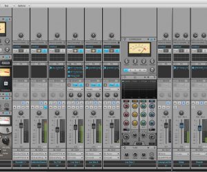
Overall, the new Apogee Maestro 2 software interface has been nicely redesigned. While most things have remained largely unaltered, assignment of the aforementioned touch buttons is found under the Device Settings tab. The main screen now has dedicated output controls with mutes and you can also name channels – although this doesn’t mean the channels show up in your DAW as ‘Pete’s voice’ or ‘Gibson Les Paul’. Labelling channels simply helps remind you of what’s plugged in at a glance, so long as you remember to keep renaming things when your input sources change. On that note, even though the newly redesigned breakout cable on the Duet 2 looks better and less cluttered, the combo jack means you don’t have the physical sockets to leave stuff plugged in. I find myself having to plug and unplug things all the time now, whereas with the original Duet I was able to have bass and guitar permanently plugged in as well as a couple of different mics. Thankfully Apogee also make an optional breakout box featuring two XLR and two 1/4-inch inputs and two balanced XLR outputs, for those who want a more permanent setup.
One other significant design change is that the Duet 2 comes with a 5V DC wall-wart power supply, to help power the unit if there’s too much current being drawn from multiple devices on your Mac’s USB2 system. This can occur for instance when both mic inputs are drawing phantom power and the user is running the soundcard at high output levels. A warning to plug in the adaptor is shown either on your Apple screen or the Duet 2’s OLED display (As it was, I kept mine plugged in all the time).
Finally, the new Apogee Duet 2 has a fancy new one-piece rubber slip mat on its underside, which is definitely a step up from the original Duet’s rubber feet.


RESPONSES