Review: Avid Pro Tools Dock
Avid’s Pro Tools Dock will be the centrepiece of your mix setup, if you let it.
Review: Anthony Garvin
My general philosophy flows over to the way I approach mixing: have fun and make life easy. Whilst software mixing has certainly made life easier, it hasn’t made it more fun. Control surfaces exist to help smooth over the gap between software mixing and hardware tactility to make the whole process more enjoyable. Who doesn’t like twiddling knobs and moving faders? The best ones will get your hands off the mouse and keyboard without you even realising it.
When Avid announced the Pro Tools Dock over a year ago, I was so interested to see how far it could blur those lines that I put my hand up for the review way back then. It seemed that by combining the well-established EuCon protocol and a wealth of inherited Euphonix hardware knowledge, with the power and tactility of an iPad, Avid had the makings of a superior controller. Obviously, getting all that power to play well together took its time, because it was a 10-month wait before the hardware was realised and a demo unit landed in my studio.
PIZZA DELIVERY
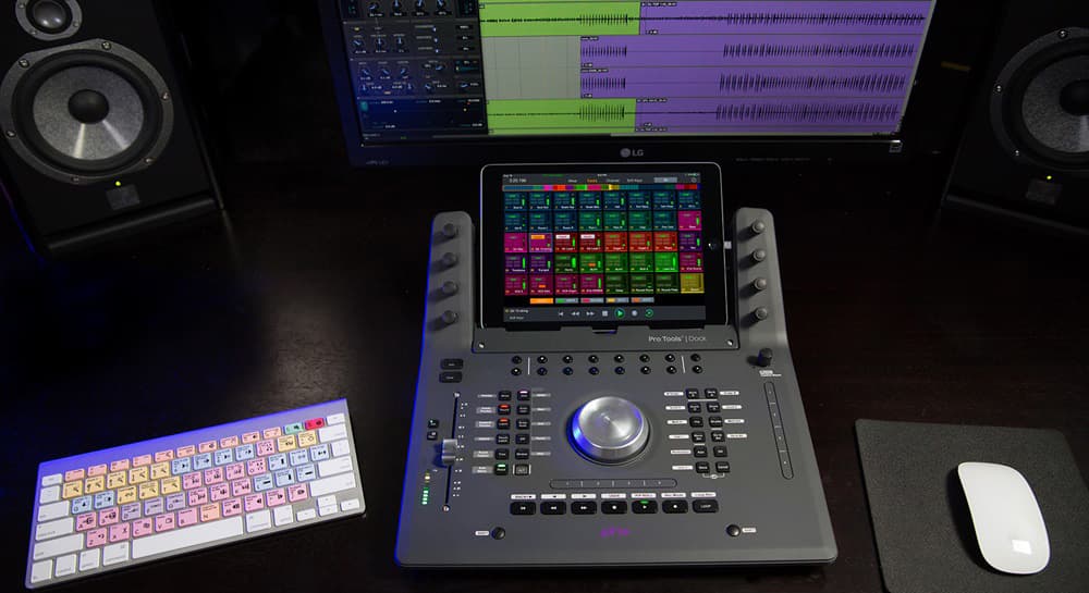
When that day finally came, I was surprised to unbox a unit the size of an extra-large pizza. It’s quite solidly built, and while it’s only 35cm wide, the Pro Tools Dock takes significantly more desk space than the Artist Mix or Control units because it needs about 40cm of depth to sit comfortably with an iPad mounted. While the Dock will technically function without an iPad, it’s limited to transport, jogwheel and fader control. If you’re buying a Dock, the iPad isn’t really optional, as it forms the central ‘brain’ required for navigation, plug-in control and all soft-assigned features.
With the initial real estate shock aside, I moved on to setting up the Dock with my Pro Tools system. Saying it was an involved process is putting it lightly, though the system has been very stable since. You see, whilst the Dock not only requires an iPad for most functions, it needs a fairly recent model — anything beyond the iPad Air, except for the incompatible 12.9-inch iPad Pro — with the Pro Tools Control app installed. The co-dependent computer requires at least Pro Tools 12.5, with the latest version of the EuCon software installed, and an ethernet connection to the Dock (either directly or through a network switch). It’s not a hugely demanding list of requirements, but certainly a few more hoops to jump through than your average USB-compatible controller.
When setting up the Dock via the EuControl settings, I found that whilst the Dock has a USB connection for the iPad, it turns out that connection only provides power. The PT Control app interfaces with EuControl over Wi-Fi, just like it does without the Dock hardware. Initially I was concerned about reliability and responsiveness, but it hasn’t been a problem at all, even when using a simple Bigpond router for my wireless network.
WHEELING AROUND
As is the case with these bridging devices, the pain was mostly in the setup. The learning curve and fun factor dramatically sped up once everything was connected. In the middle of the Dock is a nicely-weighted, 65mm aluminium wheel, which functions as more than just a jog or shuttle. Without too much fuss I was able to zoom horizontally and vertically, scroll in a similar manner, mark in and out points and move my selection. I even accidentally adjusted clip gain via the ‘User 1’ function, which led me to investigate what other parameter controls were lurking behind the option buttons. I discovered that while many common functions are pre-set to buttons on the Dock, almost every button is customisable. If you find you never use a particular button, it can be diverted to another function via the EuControl settings. The wheel sensitivity seemed just right straight out of the box to me. However, should you disagree, that too is adjustable via EuControl.
NEED TO KNOW
AVID PRO TOOLS DOCK
iPAD-ASSISTED CONTROL SURFACE

ASSIGN ME UP
On either side of the iPad mount are four vertically mounted soft-knobs. Gaining control of a plug-in requires a couple of quick selections on the iPad — you select the channel on the iPad, and from that channel’s page choose the plug-in from the available list. Once selected, the plug-in pops up in Pro Tools on your workstation screen and the first eight parameters of the plug-in are assigned to the Dock’s knobs. It’s a fairly intuitive process for users who immerse themselves in a controller and don’t rely on the computer screen. However, if you prefer to use a mix of software and hardware controls (as I do), the Dock doesn’t simply automatically map to whatever plug-in is selected onscreen — which was a bummer!
To simplify the plug-in controlling process, Avid has implemented a generic set of EQ and dynamic controls in the channel page’s list of plug-ins. Regardless of the selected plug-in manufacturer or model, it picks the first EQ or dynamics processor in your signal chain and controls them with predetermined assignments. For example, release and attack on the first dynamics plug-ins will always be the first and second soft-knobs. This certainly makes familiarisation much easier, though it has limited use when implementing multiple dynamics instances on a single track, as only the first plug-in is accessible with the predetermined mappings.
The knobs are apparently very similar to those on Avid’s flagship S6 — which I personally haven’t used — but they have a fairly solid feel and dynamically adjust their sensitivity (the faster the knob is moved, the quicker the parameter changes, and vice versa). This takes a little getting used to, but after a while I found them quite functional and enjoyable to use.
The Dock doesn’t simply automatically map to whatever plug-in is selected onscreen — which was a bummer!
FADES AT THE TOUCH
In the bottom left area of the Pro Tools Dock is a 100mm touch-sensitive and motorised fader, which assigns to the track selected on the iPad, or within Pro Tools directly. Like many others, I find it easier to find a good balance using a real fader rather than staring at the screen and moving a mouse. The fader is responsive, has a nice feel to it, and proved extremely useful. Purchasing a Dock solely for this purpose would be unnecessarily expensive, but the fader’s responsiveness and ease of use is certainly a big plus. On the negative side, the Dock doesn’t currently accommodate using the fader to adjust send levels, it would require a software update for that.
On the left side of the fader is a record enable button and small meter useful for checking signal but not much more. Above are large mute and solo buttons, and to the right are 12 dedicated automation buttons such as Write, Touch, Latch and Trim. By default, these are setup as global buttons that correspond to the automation modes currently in use across the whole session. However, an option in the EuControl settings alters the buttons’ function so it changes the mode of the selected channel, which was my preference.
ALL BUTTONED UP
Aside from the pre-mentioned buttons for the wheel, fader and automation, the Pro Tools Dock features seven large transport buttons at the bottom of the unit — right where they should be for quick playback control. Two shift buttons, located just below either side of the transport, effectively double the number of functions available on the Dock, and a nifty shift + fader tap resets the selected channel to unity gain.
Running horizontally above the transport, and vertically along the right side of the Dock are a set of touchstrips with four zones. These are unassigned (except for the shift layer) by default and configurable via EuControl. You’ll have to get your masking tape out, as there’s no scribble strip for these functions, though these would become second nature after frequent use.
Up the top of the unit, just below the iPad mount, are 16 soft-assigned buttons. Similar to the touchstrips, these are freely configurable, but do have a number of pre-set assignments. Pressing the lower left soft-button displays the assignments on the bottom of the iPad, while the rightmost buttons scroll through a number of preset banks of control options. Perhaps I am being too pedantic, but was it really necessary to have buttons simply replicate what the touchscreen is doing? Having said that, I could find 16 favourite buttons to be my go-to options here. Undo was one of them, as there’s no dedicated Undo button on the Dock.
DOCK HERE FOR A WHILE
Overall, I’ve enjoyed integrating the Pro Tools Dock into my mixing process. There were a few subjective ergonomic changes I would have preferred, like swapping the position of the soft-buttons and rotary encoders. Also, the inability of the iPad and dock to dynamically update to selected plug-ins means I’d have to change my habits and really immerse myself in using the Dock to get the most out of it. That’s really the key here. The Dock didn’t feel like a magical bridging device that slotted seamlessly into my established workflow; it actively pulled me away from my screen.
While I enjoyed using the Dock, it felt like an expensive way to go about what 80% of Pro Tools users want — i.e. transport, jog wheel and plug-in/channel control. However, for heavily invested users who are willing to put this front and centre in their workflow, it could dramatically change their connection with Pro Tools, and the Dock/iPad pairing integrates more closely than simply using an iPad with EuControl, and another controller. For S3 users who are already heavily invested in a hardware control system, the Dock makes an excellent complement to that workflow, adding missing hardware features like a transport and jogwheel.
Lastly, the question of obsolescence hangs over any hardware device, and is impossible to guess at the beginning of a product’s lifecycle. It’s hard to say whether the Dock’s reliance on the iPad is a pro or con. On one hand, it adds an external bit of hardware that could fall into an unsupported state. On the other hand, it allows Avid to evolve its EuControl software to adjust to user demands, and the option to upgrade the Dock’s brains with new hardware while keeping the staples of fader, jog wheel, transport, buttons and knobs the same. On the face of it, that seems like a bit of security for your investment.


RESPONSES